How to create a new Twitter background
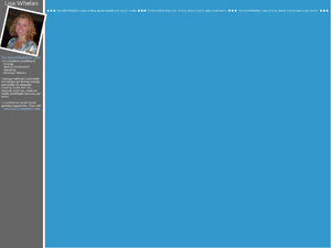
July 31, 2009 by Lisa Oshima | Consulting, Developers, Social MediaI just updated the background on my Twitter profile, and thought it might help to share some of what I learned in the process. Here’s how my new Twitter background looks:
Recreating this look (or a variation of it) is VERY easy, if you’ve got Photoshop. You really don’t need to pay someone to do it for you to get a decent result. Here’s how I created mine:
- File>New
- Set ‘canvas’ size to 22.222 x 16.667 inches (that’s 1600 x 1200 pixels)
- Make sure you can see your ruler so that you can measure… To do this click View>Ruler
- Set your background to white
- To create the left margin (grey box above), choose the color you’d like to use from your color palate, and use the rectangular drawing tool to create a vertical rectangle that spans the vertical length of the canvas and is 7/8 inch long.
- To create the right hand section (blue above), choose the color you’d like to use from your color palate, and use the rectangular drawing toold to create a square that spans from the 3 inch ruler mark at the top of the page (i.e. 1/8 inch away from the left banner – if you want a white line between your left and right colors) to the far right and bottom of the canvas
- Now, insert a picture of yourself… To do this, just open the photo you’d like to add in Photoshop and drag it to your Twitter background project.
- If you want a white border around the photo, you’ll want to edit your photo in another Photoshop document before you insert it. To create the white border, make sure your color palate is set to white. Go to Image>Canvas Size and increase the canvas size to create an of whatever thickness you’d like.
- To rotate the photo once it’s inserted, go to Edit>Transform>Rotate and rotate accordingly
- Now, insert your desired text in the left (grey above) margin. I used a font called”Skia”. Here’s the positioning.
- Name: Start in the top left corner with your text. Mine is 30pt Skia font “sharp”
- Website URL: My photo stops at 3 3/4 inches down the page, and my website (19pt “Skia”) starts just after that.
- Description: The rest of my text (12pt Skia) starts just after that. Based on feedback I got from my Tweeps, you’ll want to stop your text at around 7 3/8 inches in the left margin so that folks on 13″ screens and netbooks can see it.
- I created the horizontal text that spans across the top of the blue section by using the circular tool to create a small white circle. From there, I duplicated the layer two times, aligned the circles so that they were side by side and merged them together. I then used the text feature to insert “SocializeMobilize.com: A blog about mobile and social media” in 14pt Skia font next to the 3 dots. I then copied both the circles and text and aligned them across the top of the page at the 2/3 inch left ruler mark.
- Once the page was ready to go as a .psd file, I saved it. From there, I created a web-ready file (.jpg) by clicking File>Save for Web
- I uploaded the new .jpg file to Twitter like this:
- Settings (top right hand corner menu)>Design (menu within the settings page)>Change Background Image


